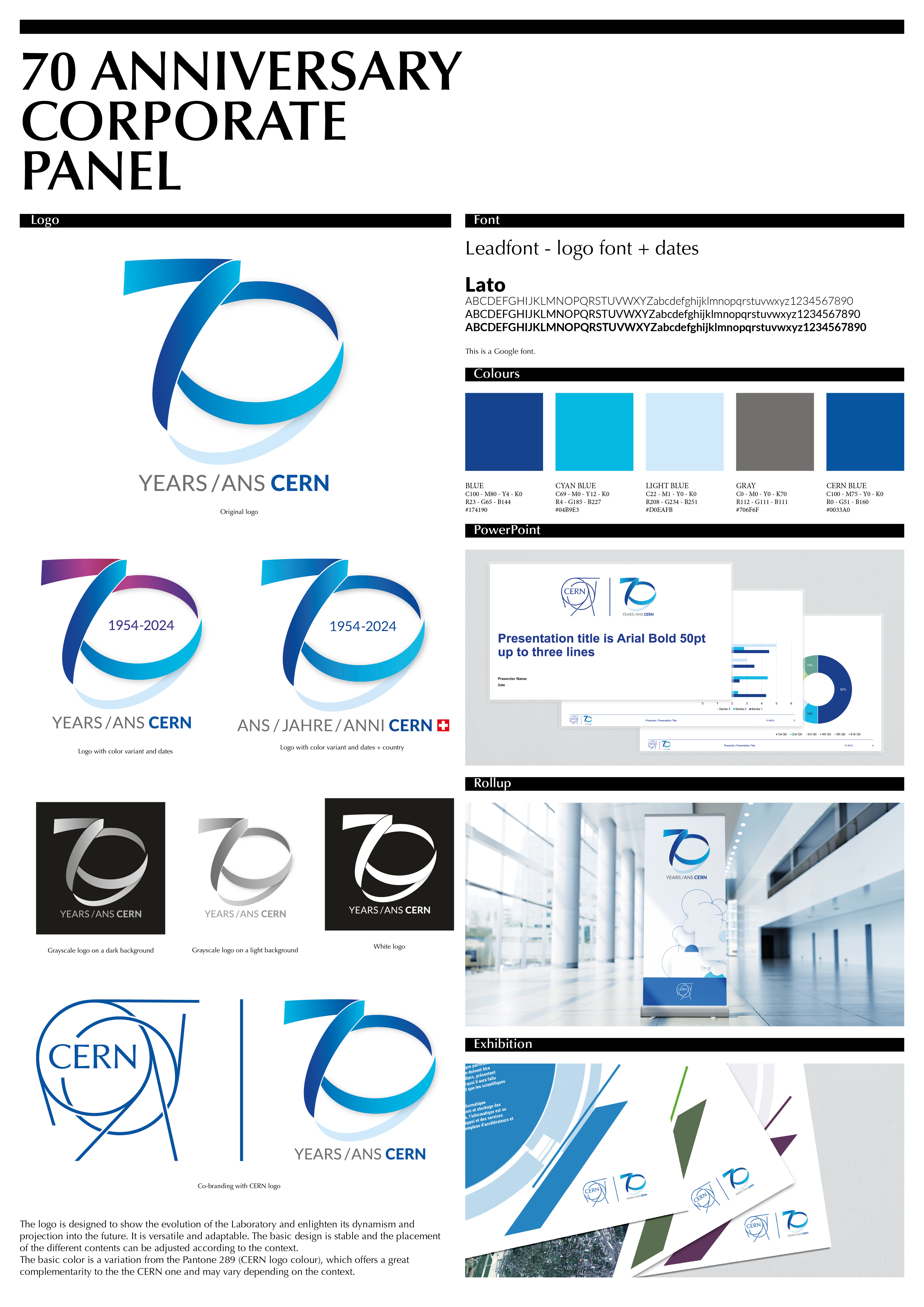
We believe in the importance of creating a specific logo that represents our event’s personality.
Looking good is primordial as the visual image we present carries an important message: CERN is a modern, innovative organisation with a clear sense of mission.
This logo evokes stability in movement.
The logo is designed to show the evolution of CERN and enlighten its dynamism and projection into the future, it is based on the accelerator chain while making “70”
It is versatile and adaptable
The basic is stable and the placement of the different elements can be adjusted according to the context:
- Years/Ans
- 1954-2024
- Motto
- Flags
The color is a variation from Pantone 289, CERN logo colour.
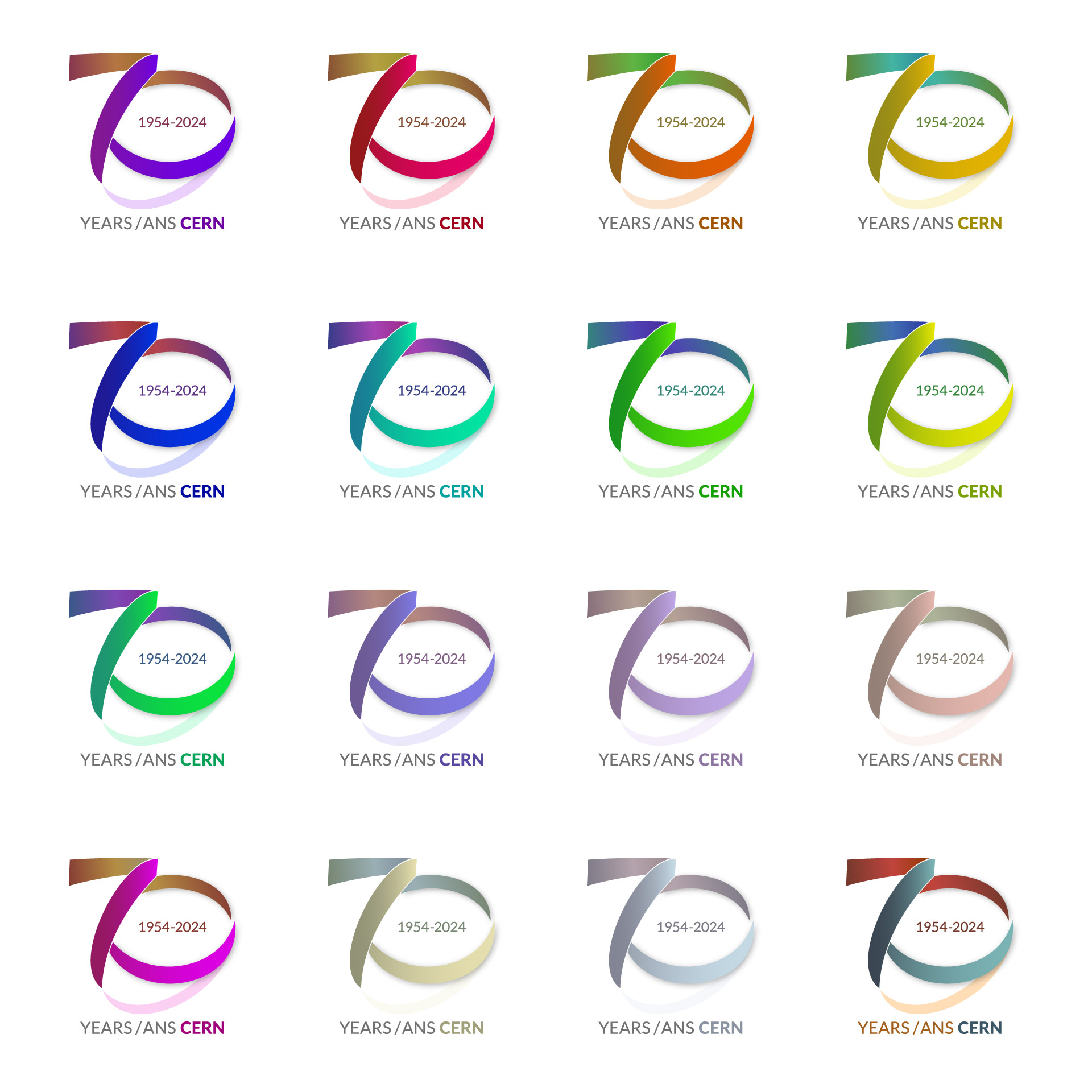
70yrs corporate logos
The corporate 70 years logo is available in the download area or here 70yrs-corporate logos | CERN Design Guidelines
70yrs logos by country
Our event is a multi-channel, multi-audience communications and outreach campaign.
In order to be as inclusive as possible, a version of the logo by country is available in the download area or here 70yrs-logos by country | CERN Design Guidelines
An authorization is required to be able to use it on external communication tools, please contact Fabienne Landua
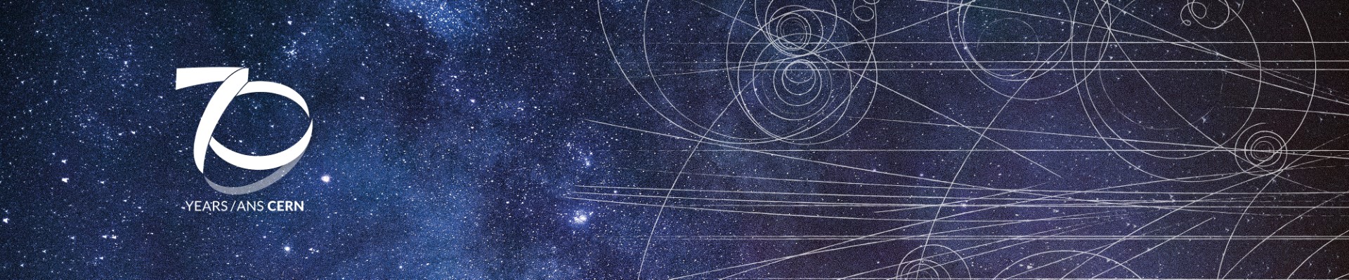
This panel, shows the different aspects of our brand development.
70yrs LGBTQ+ logo
The customisation of the 70yrs logo design and colors reflects the diversity of the LGBTQ+ community and the spectrum of human sexuality and gender.
The 70 years LGBTQ+ logo is available in the download area or here 70yrs lgbtq+ logo
|
|