Colours
Colours Informations
Origins
The mental associations of colours give them a symbolism that can vary according to cultures and individuals. Blue is the favorite colour of Westerners, it has a positive meaning. It evokes the colour of the sky, and oceans. In this same perspective, we can even say that it pushes us to knowledge, to the understanding, to the fundamental questions, to the depth of things.
It is also the allegory of peace (flags of the UN and European institutions that are blue).
The “blue” colour field includes many shades that are either saturated, such as ultramarine blue, desaturated, such as sky blue, or light, or dark like midnight blue. It ranges from blue-green or turquoise to ultramarine blue and purplish blue.
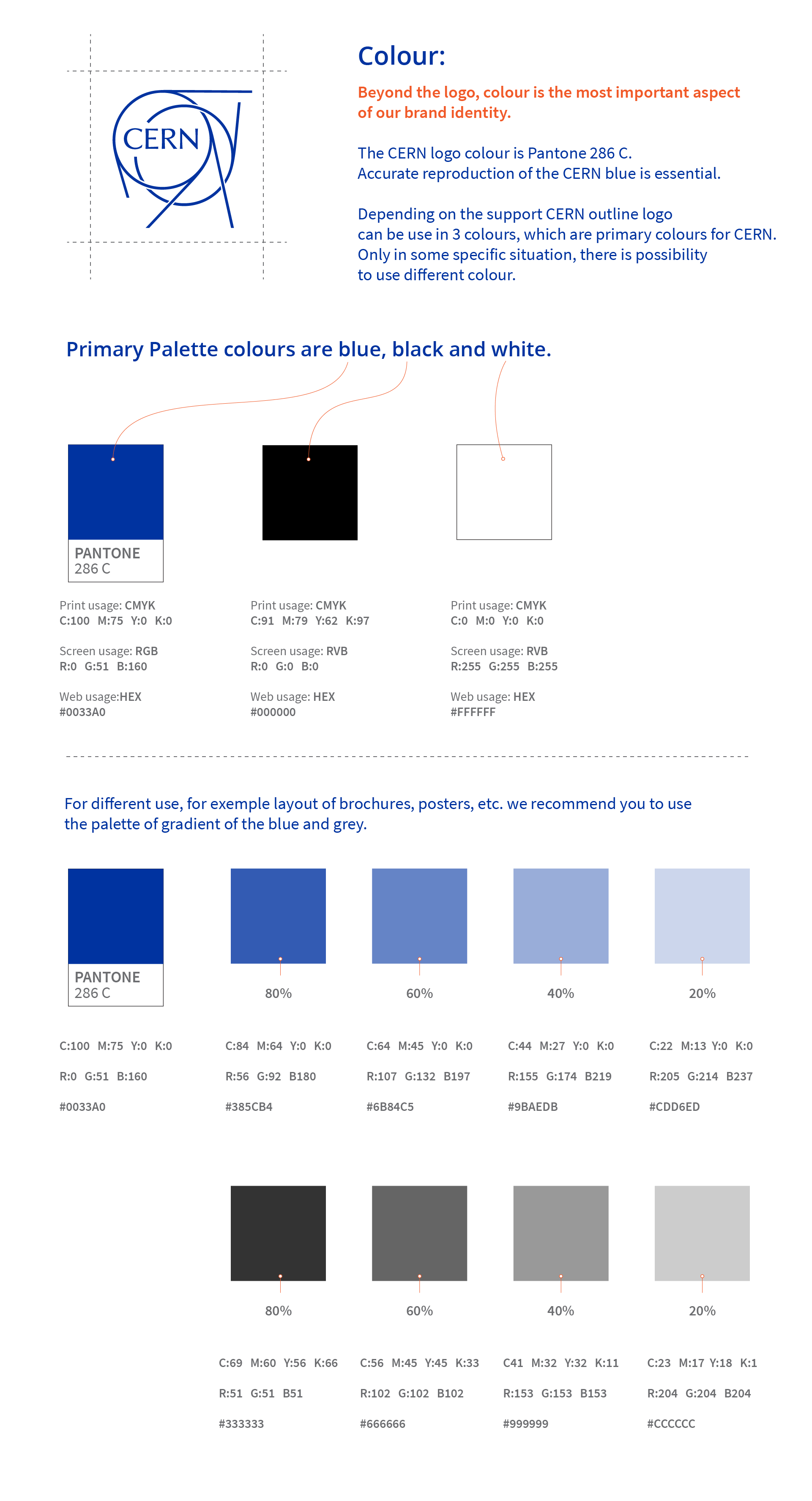
The wavelengths of the blue lights range from about 450 to about 500 nanometers; including blue-violet and blue-green. The CERN blue is at about 472.82 nm.
Spectrum
The main difference between the three different color spectrums is that they’re based on the intended use of the design. Designing something for a website or other online consumption will use RGB, whereas print designs can use either CMYK or PMS depending on the level of exactitude required.
RGB adds color to a black screen. Each value adds light to the screen in the form of a color we can see — an additive color spectrum.
CMYK subtracts light from a white sheet of paper to create colors. Each value subtracts light from the paper in the form of color we can see – a subtractive color spectrum.
Pantone swatches usually contain all of the different color models you might need for a given color.
Color talk may sound like a different language, there is no single colour system that is suitable for all design projects. We worked nevertheless on the conversion from one system to another, here are the values that we propose.